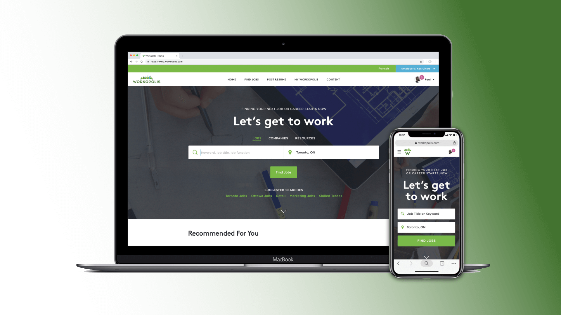
Workopolis
Redesign
Workopolis
Redesign
Workopolis
Redesign
Workopolis
Redesign
Workopolis
Redesign
From "home page inspiration" to complete UX strategy and redesign proposal.
CLIENT: Workopolis.com
AGENCY: Zulu Alpha Kilo
YEAR: 2015
ROLE: UX & Content Strategy, Copywriter, Creative Director
When Workopolis came to us in the fall of 2014, we had been working on the brand for several years already. And while some of that work extended into the digital domain, it mostly consisted of small advertising initiatives and banner campaigns.
But with increasing competition from sites like Indeed.com, Workopolis was in desperate need of a modern overhaul. The underlying product was good, but the consumer facing brand and design was dated and uninspiring.
At first, Workopolis only engaged the agency for the types of deliverables it was used to asking us for - strategy, positioning, tagline and creative brand expression.
But as that high level brand work took shape on our end, leadership at Workopolis was growing concerned about not seeing the type of fresh, inspired design they were looking for from their internal team. As it turns out, the department was well resourced to run and maintain the website, but not to remake it entirely.
It was in this light, that the job of "providing some rough inspiration for a new home page" was thrown to us.
Given the scope of the initial assignment, we undertook a light and informal discovery process. Focus was placed on improvements we could see based on a scan of the competive environment, the new direction being taken by the brand team, available research into the latest changes in user behaviour, obvious content and usability gaps and pure aesthetic appeal.
It was not hard to find some quick wins.
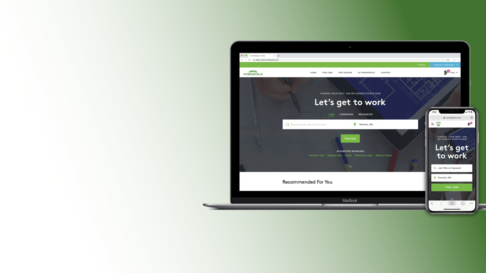
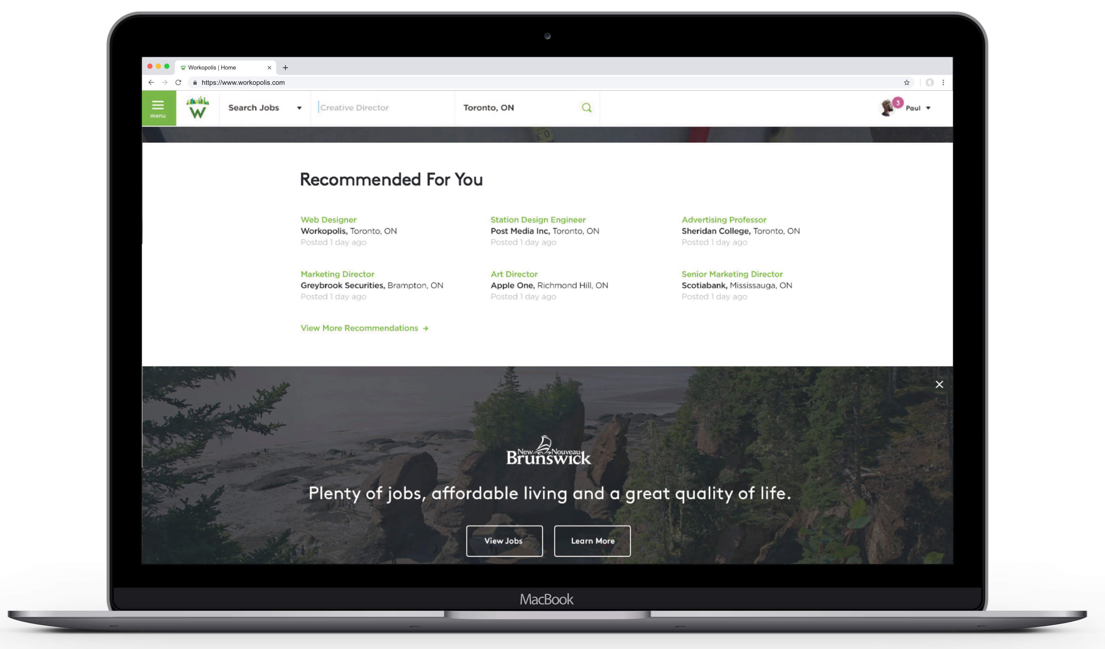
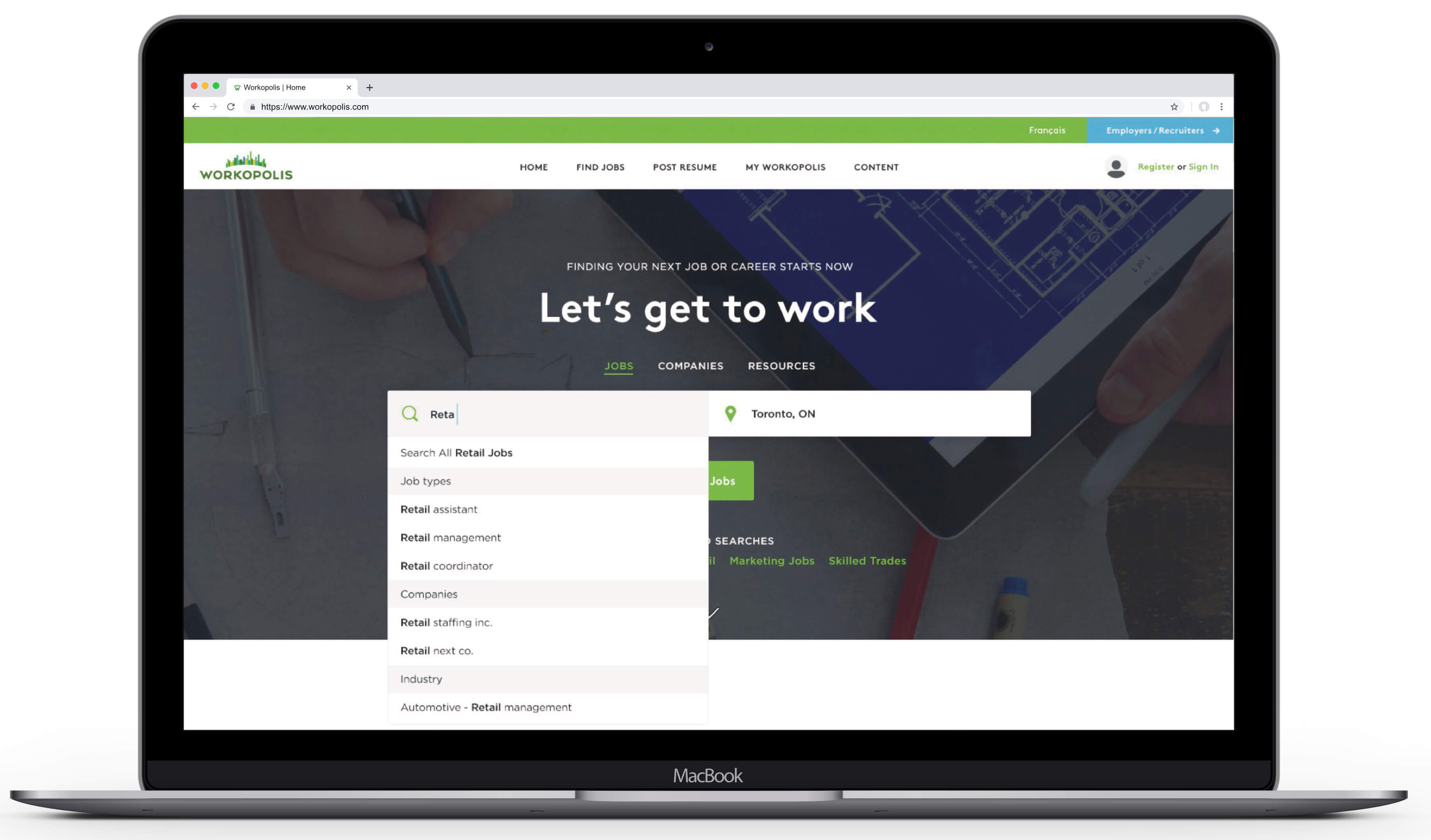
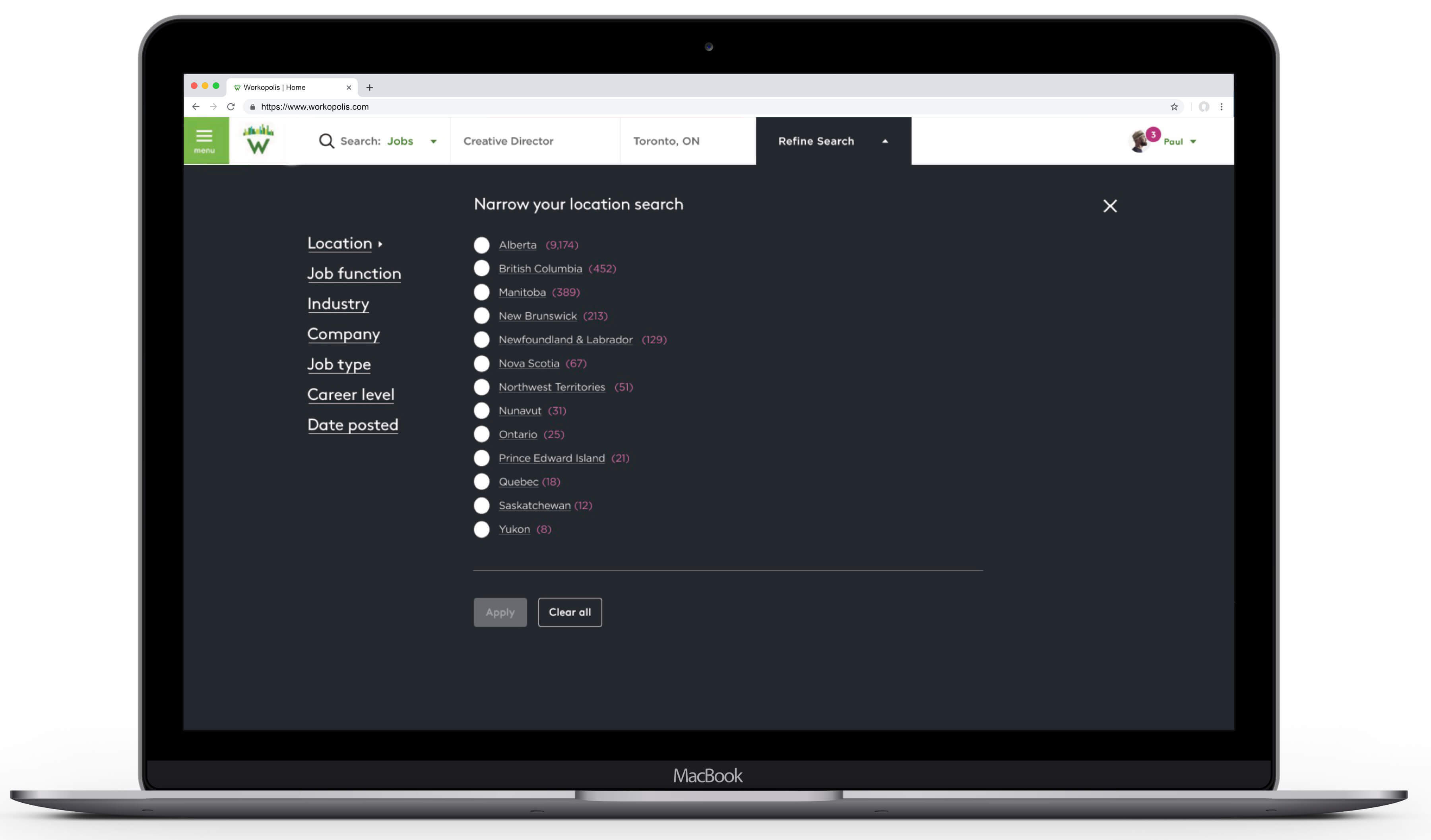
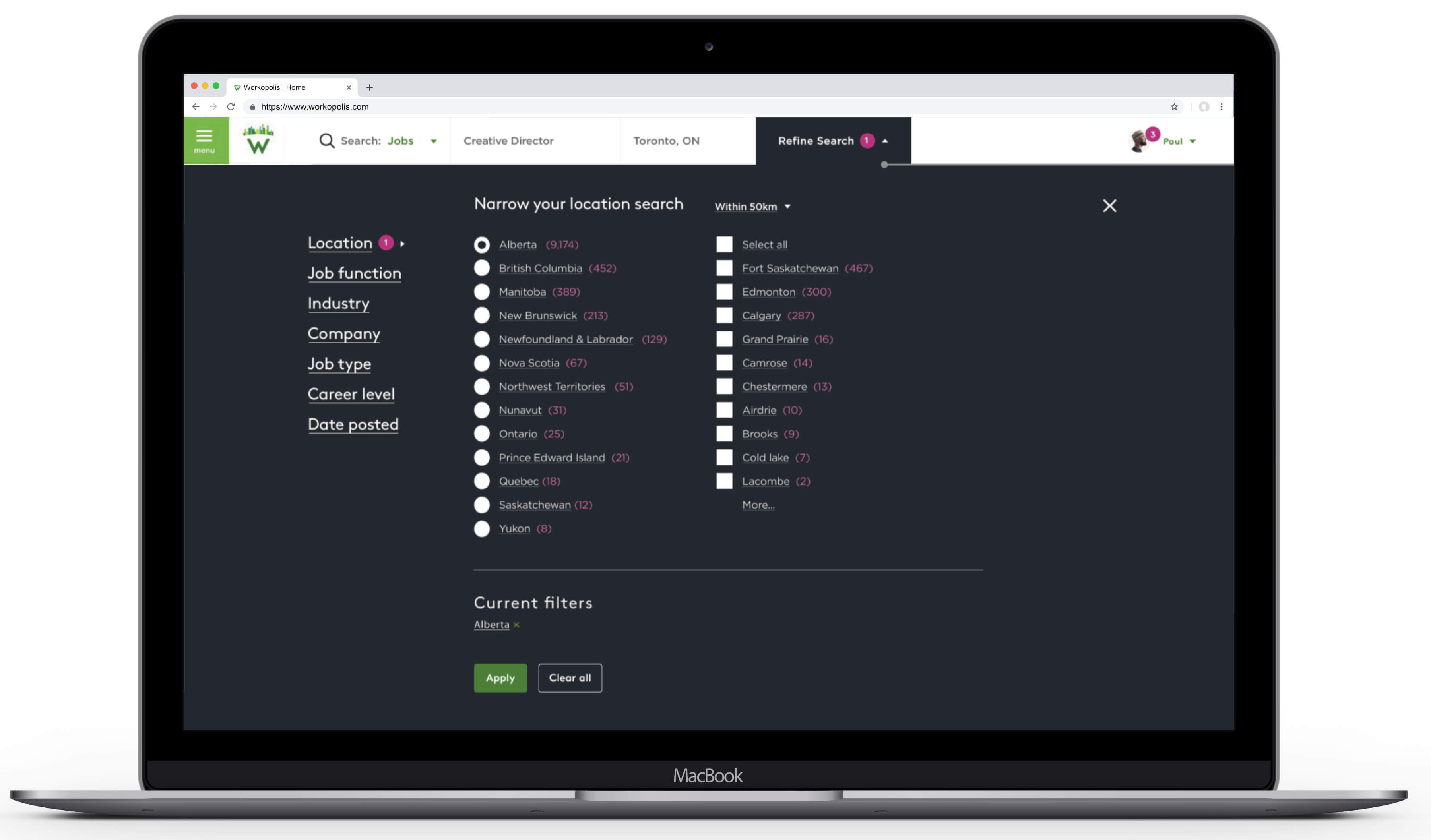
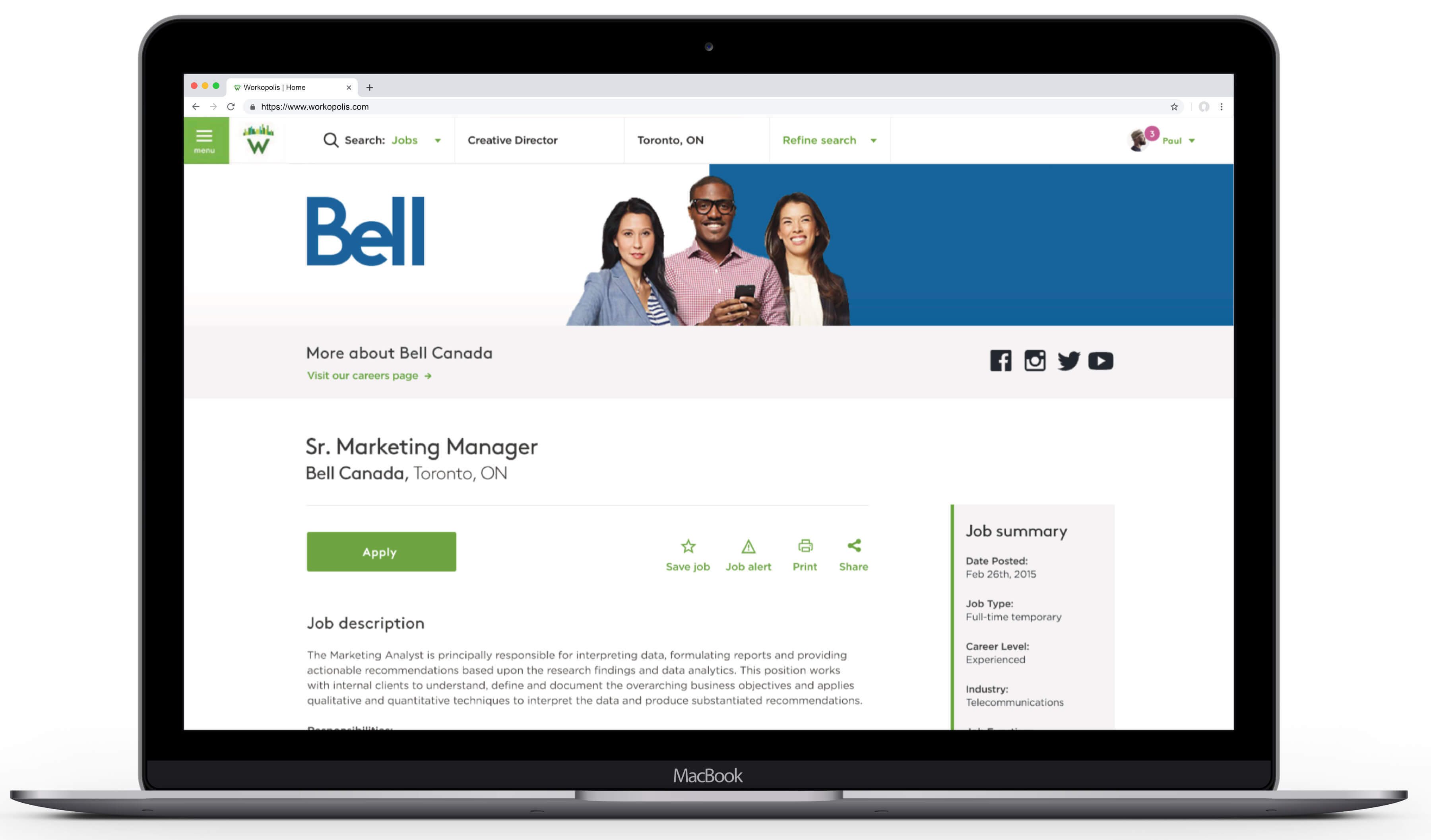
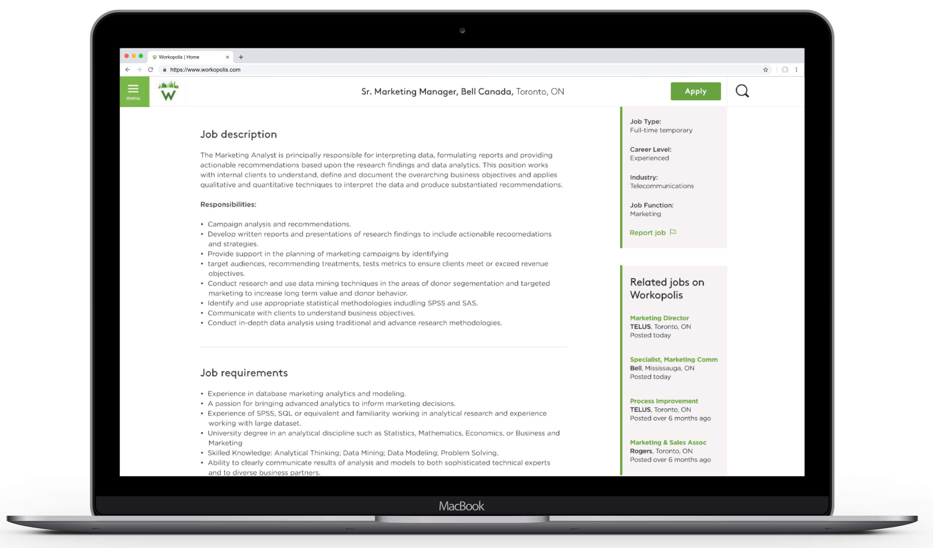
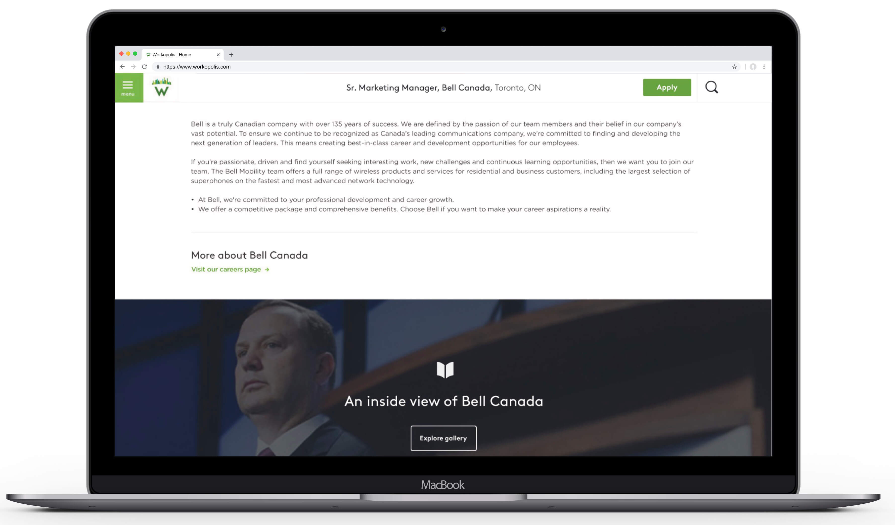
First and foremost – and especially considering the primary purpose of the business – the functionality allowing users to perform the task of searching for available jobs was almost an afterthought in the existing design of the homepage.
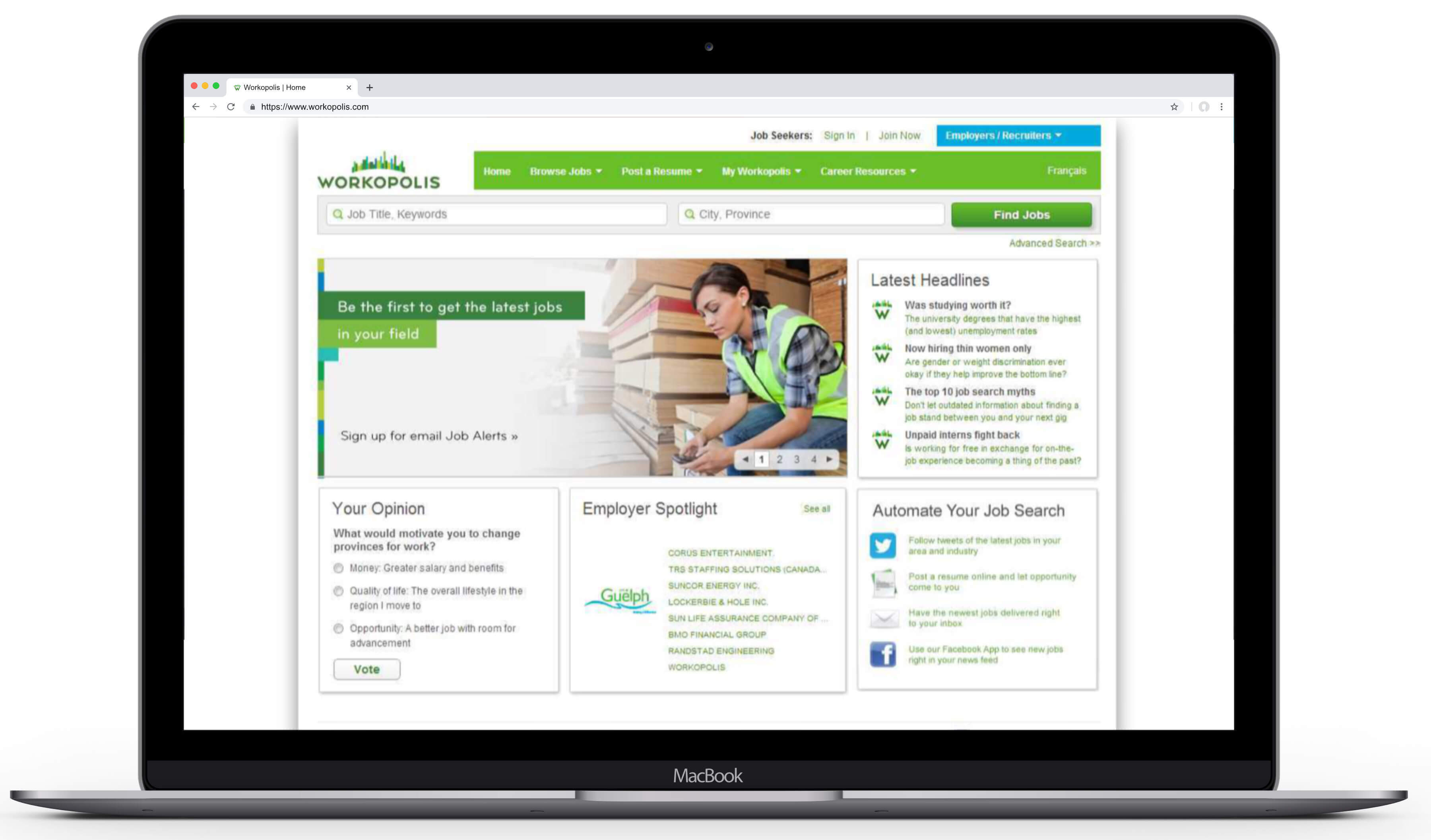
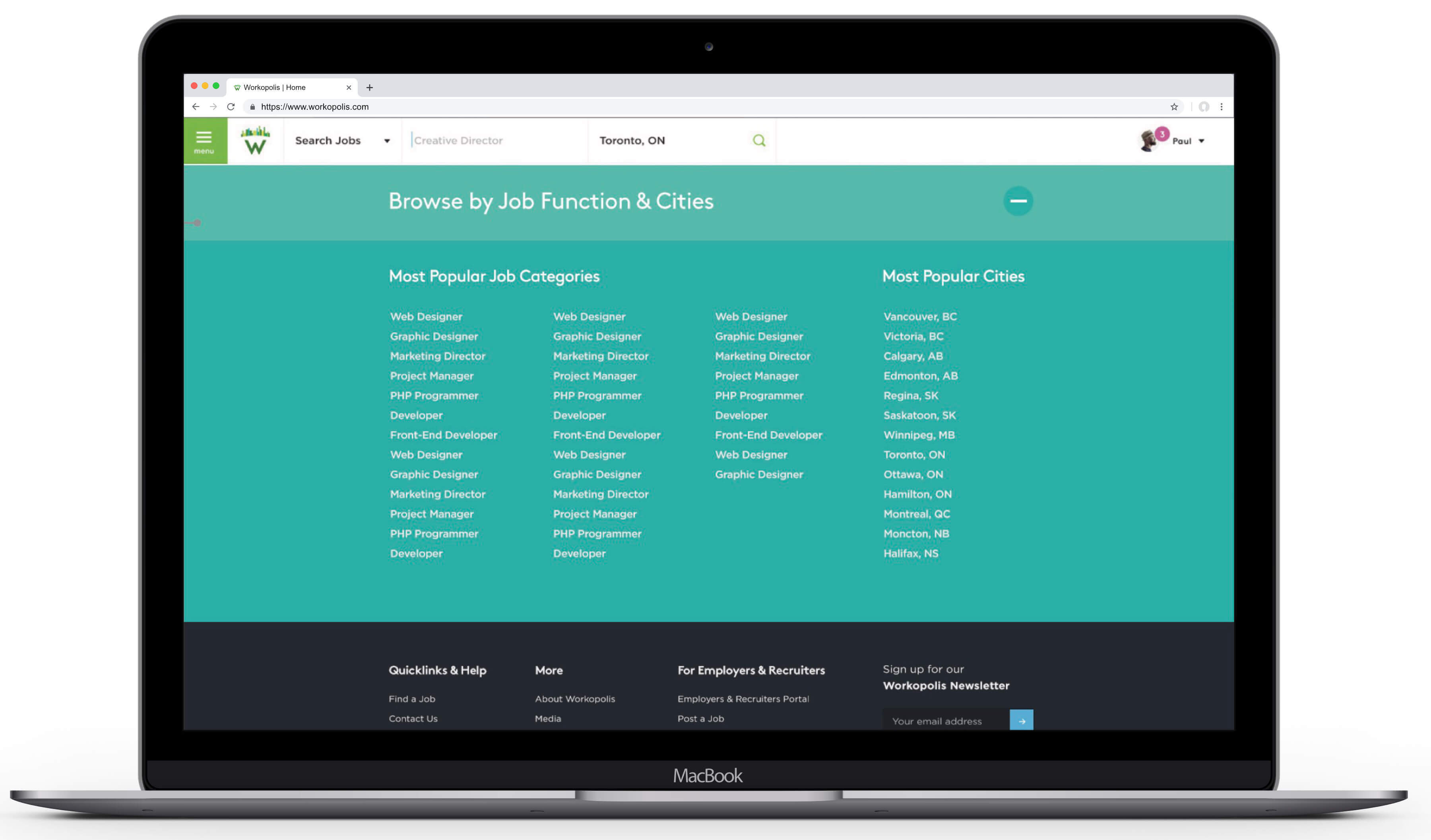
Second but related, the site's basic search, advanced search and browse functions were not only physically separate tools but also featured very different design patterns and input parameters. For users, this makes knowing where and how to perform the primary task of job searches then refining results, both innefficient and confusing.
And beyond the core job search task, it was apparent from where the ongoing brand work was leading that Workopolis.com needed to provide value beyond efficient search tools and quality job listings to drive traffic and loyalty.
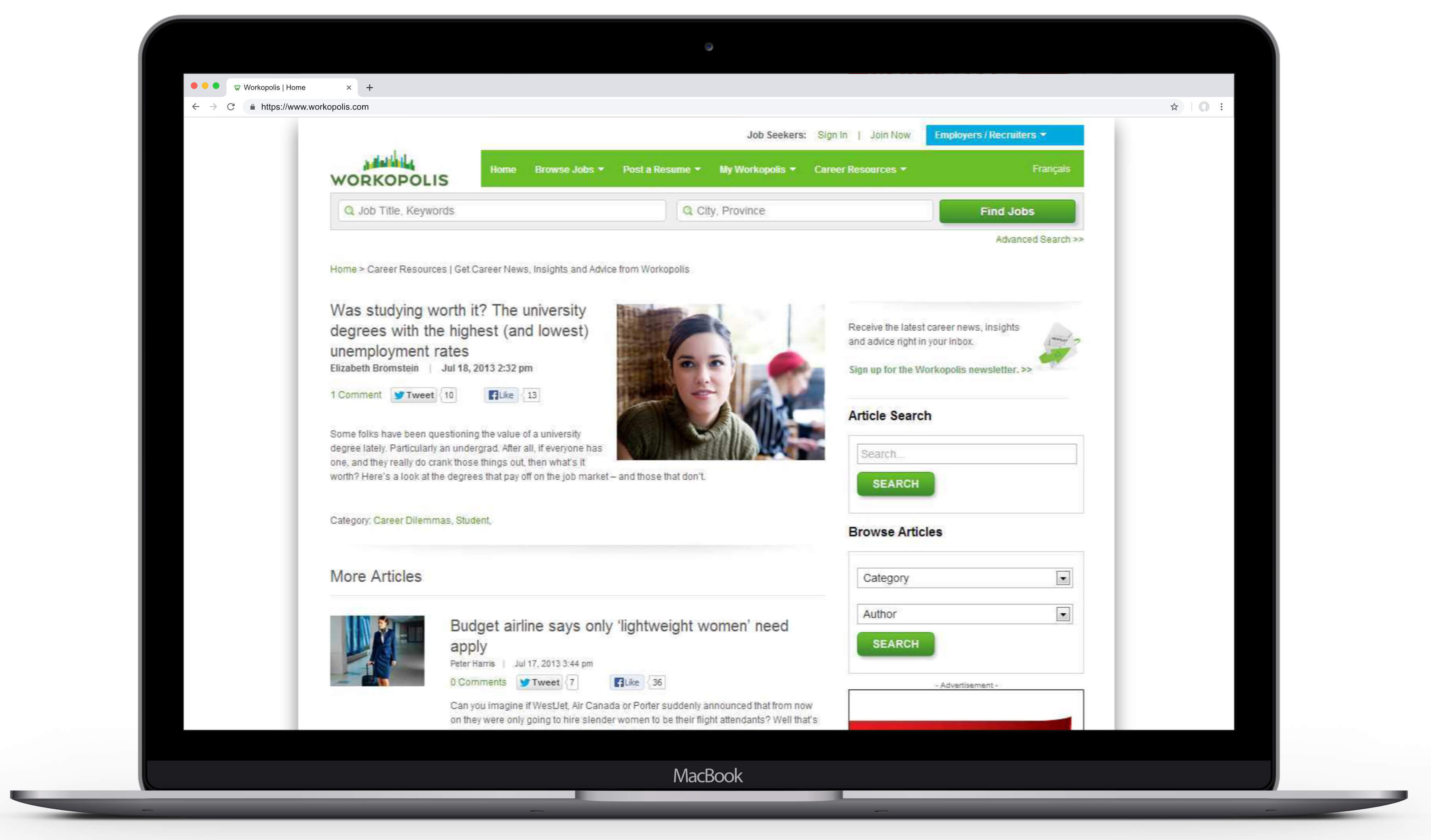
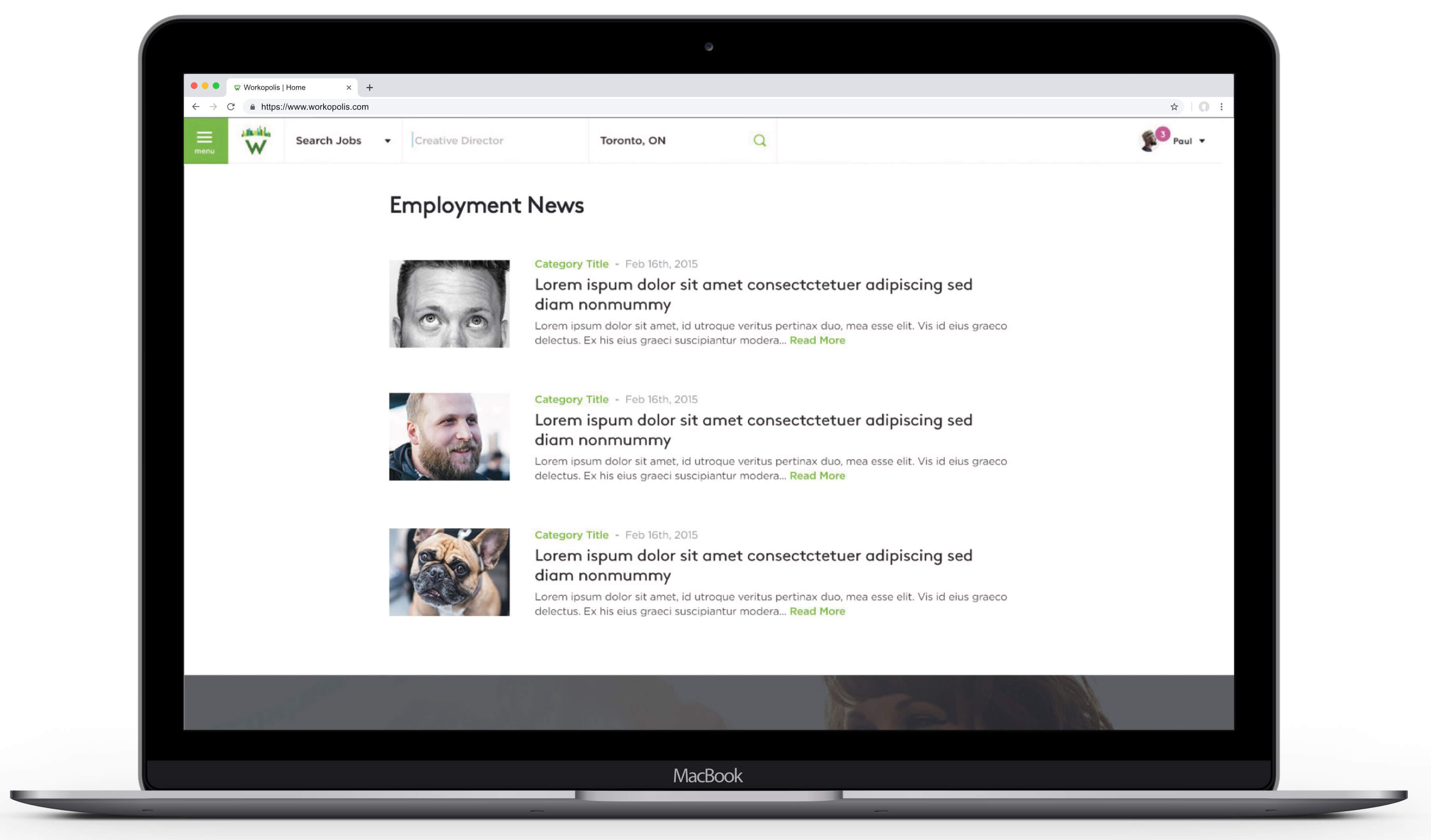
Turns out that value was hiding in plain site, buried deep in the poorly promoted news and career advice content already being produced for the Workopolis Blog. With some updates it could become the kind of career search support content that job seeker not only need, but want to consume.
Second but related, the site's basic search, advanced search and browse functions were not only physically separate tools but also featured very different design patterns and input parameters.
For users, this makes knowing where and how to perform the primary task of job searches then refining results, both innefficient and confusing.
Second but related, the site's basic search, advanced search and browse functions were not only physically separate tools but also featured very different design patterns and input parameters. For users, this makes knowing where and how to perform the primary task of job searches then refining results, both innefficient and confusing.
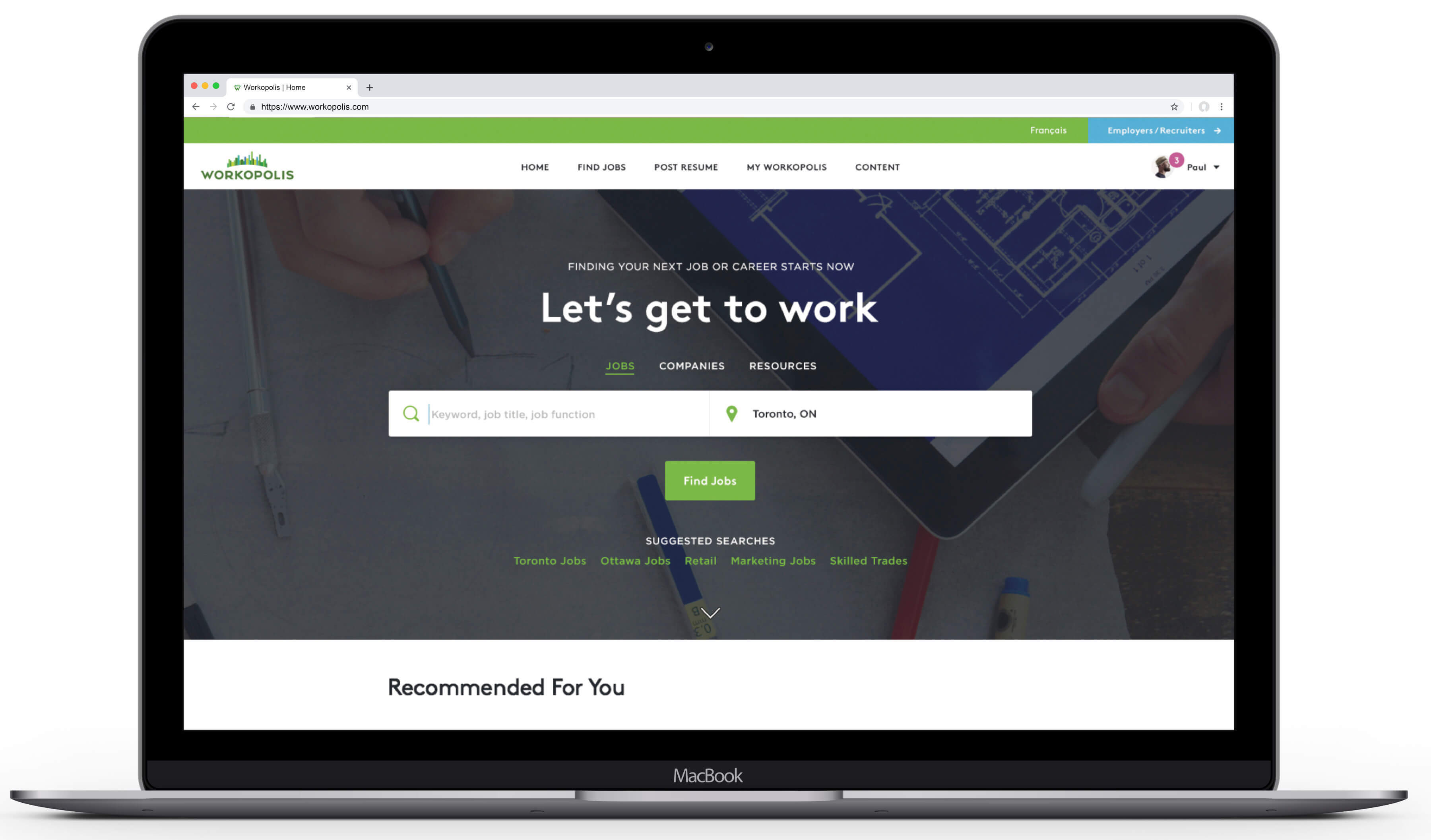
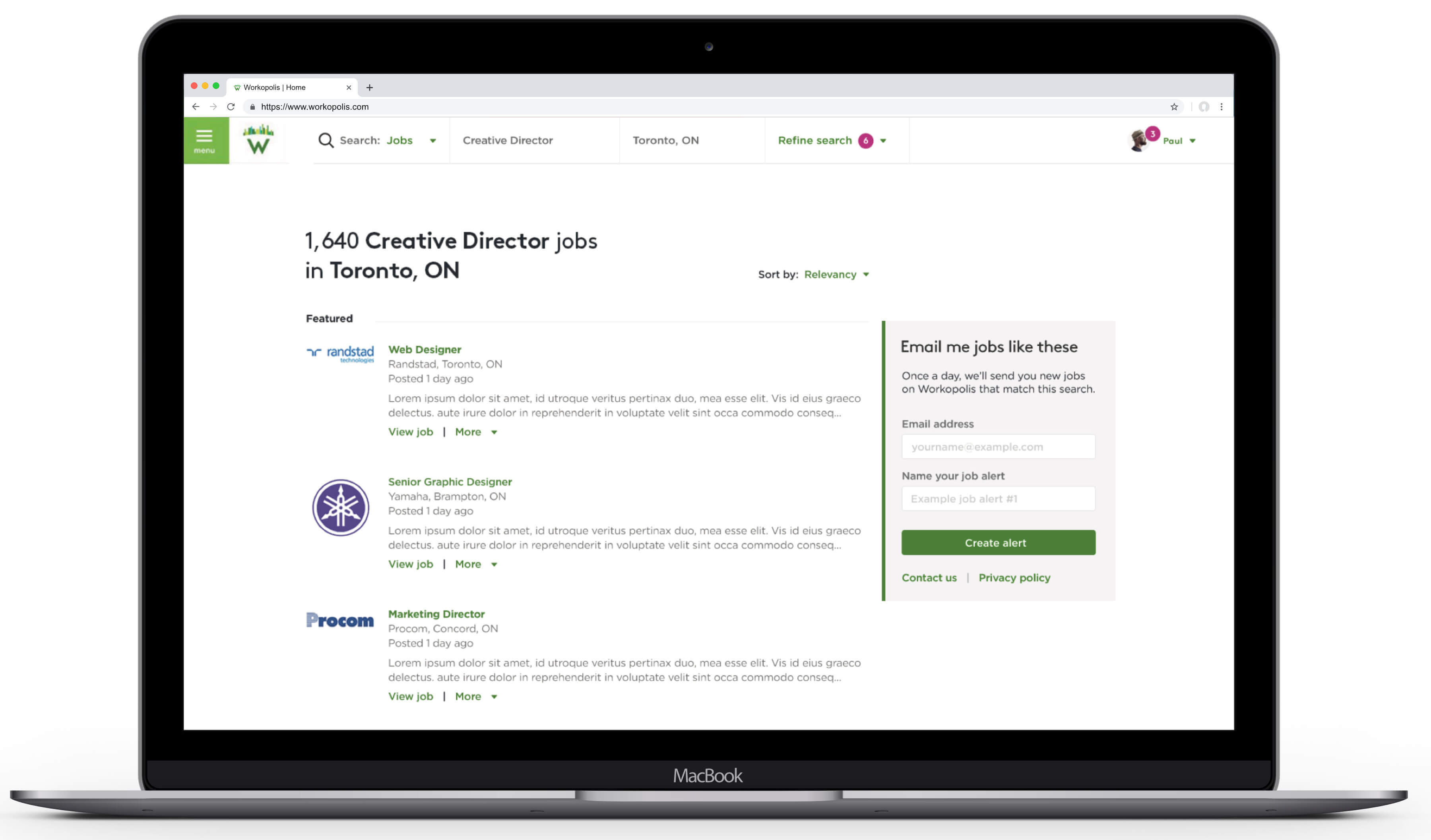
Highlights of the proposed solution include:
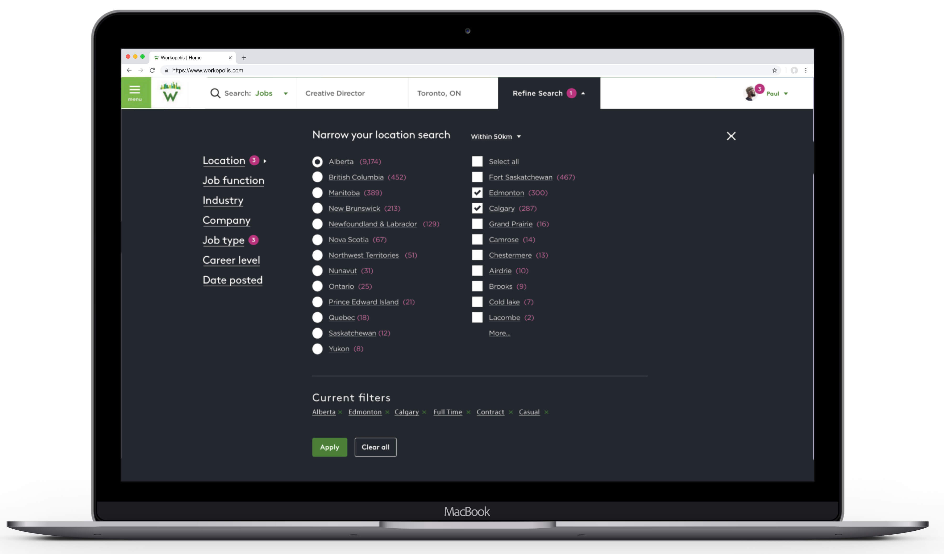
- A single, omni-present search tool combining open keyword search fields AND filter menus (dropdown, checkbox, etc.) to simplify time to task and increase usability.
- Responsive hide & reveal html 5 drawers and placement on the page (top or side) allow search filters to be accessed at any time without impacting real estate for search results and other interior link strategies.
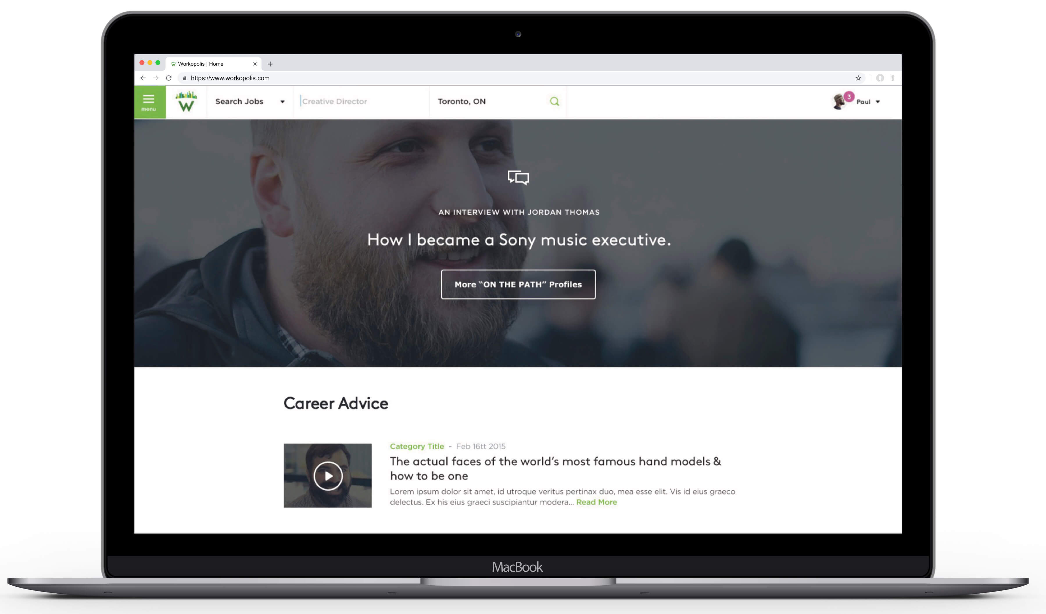
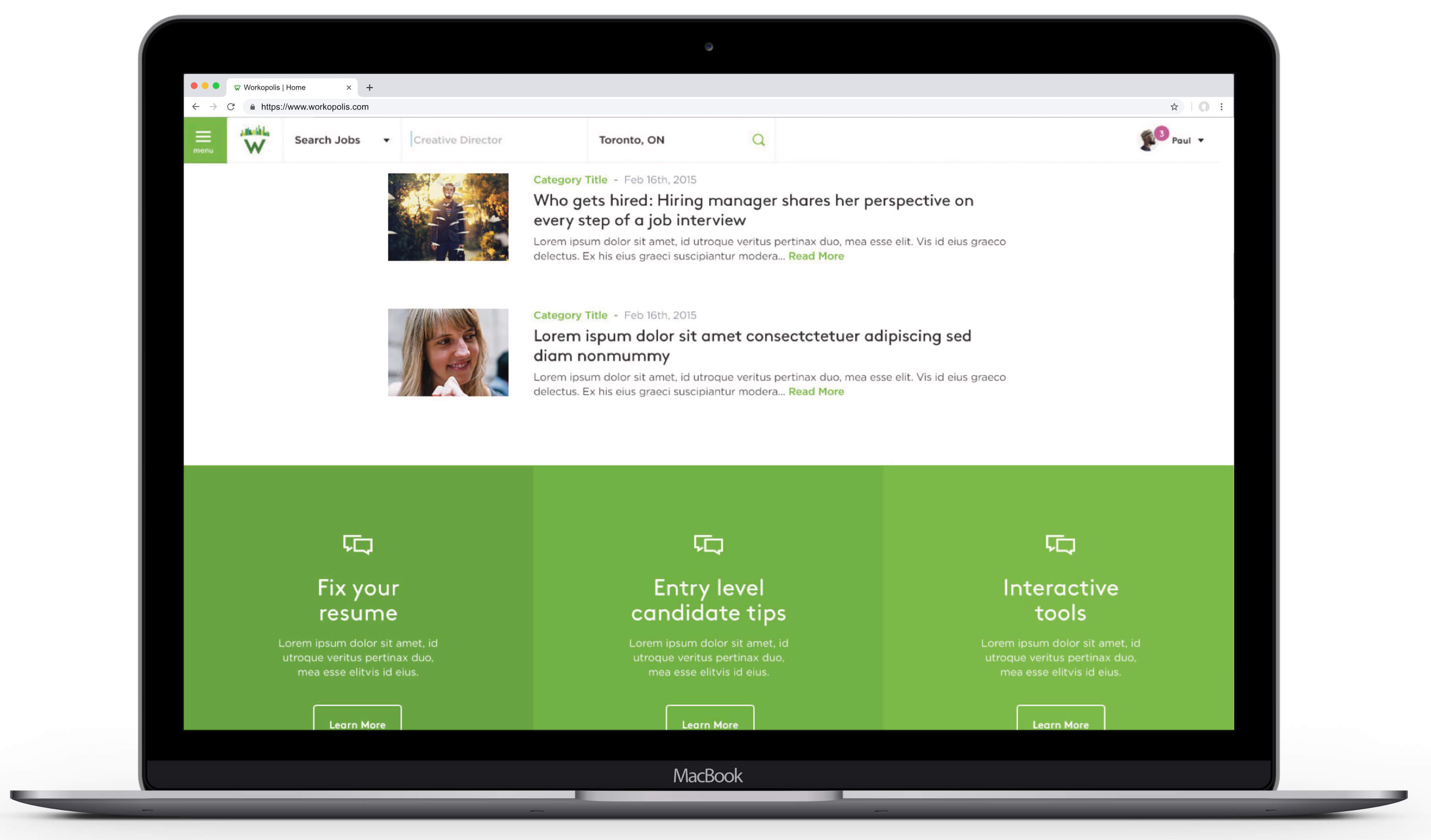
- More visual, magazine style layout would allow readers to choose and find content faster
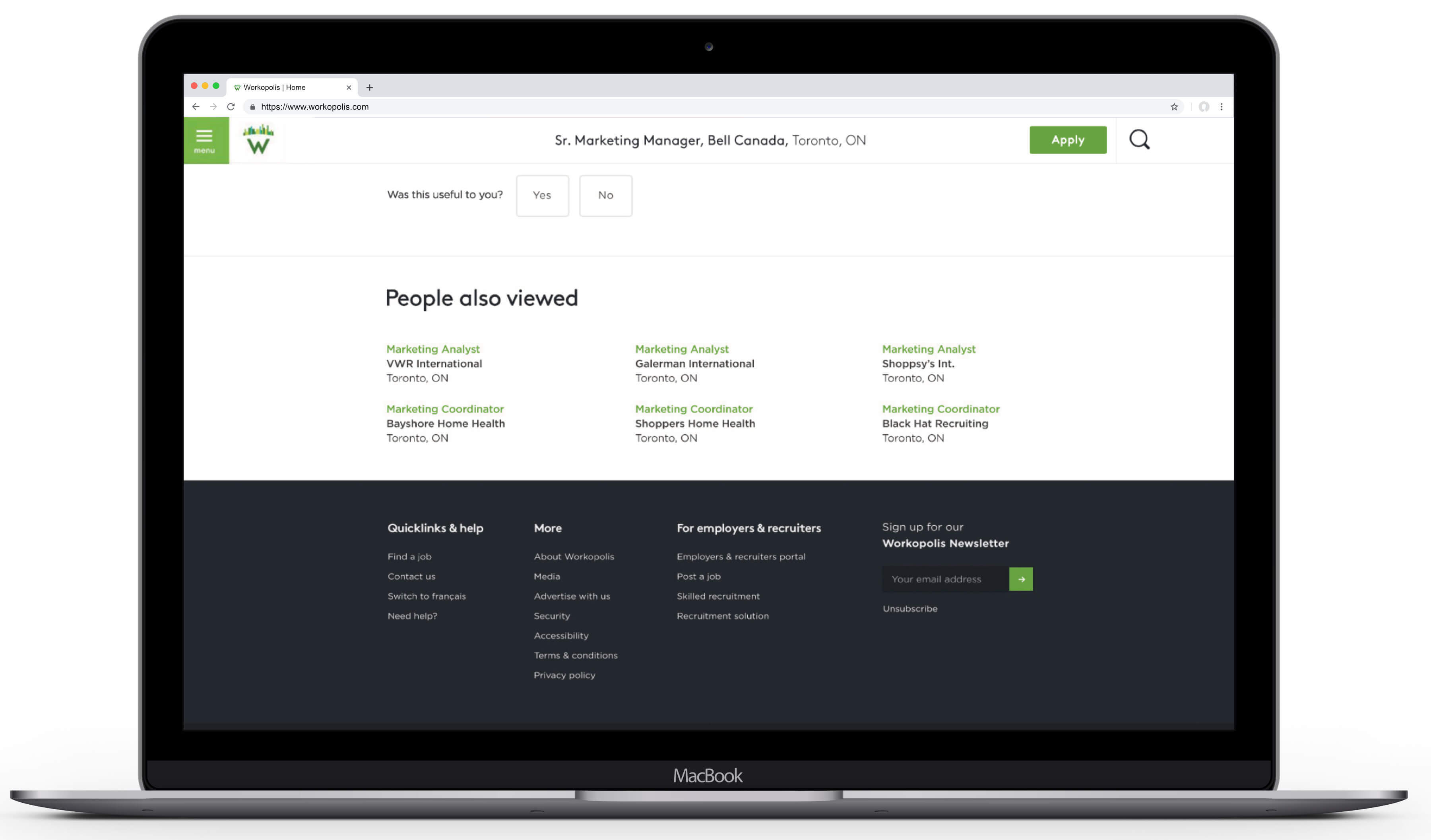
- Secondary “Next Article” navigation to move readers from one piece of content to another with fewer clicks and back tracking
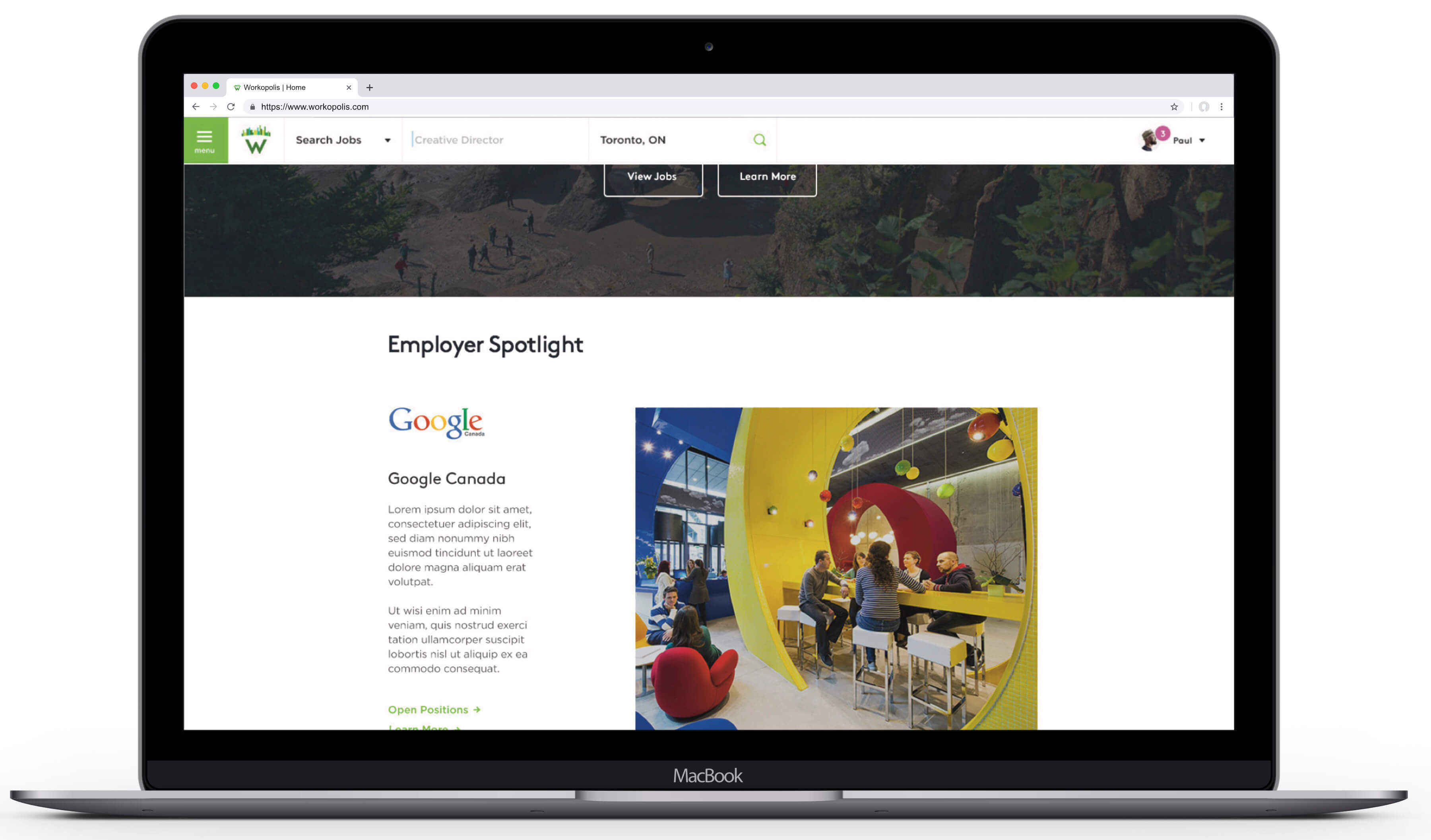
- Bigger, better (less stocky) imagery will help augment authority of commentary and incent sharing
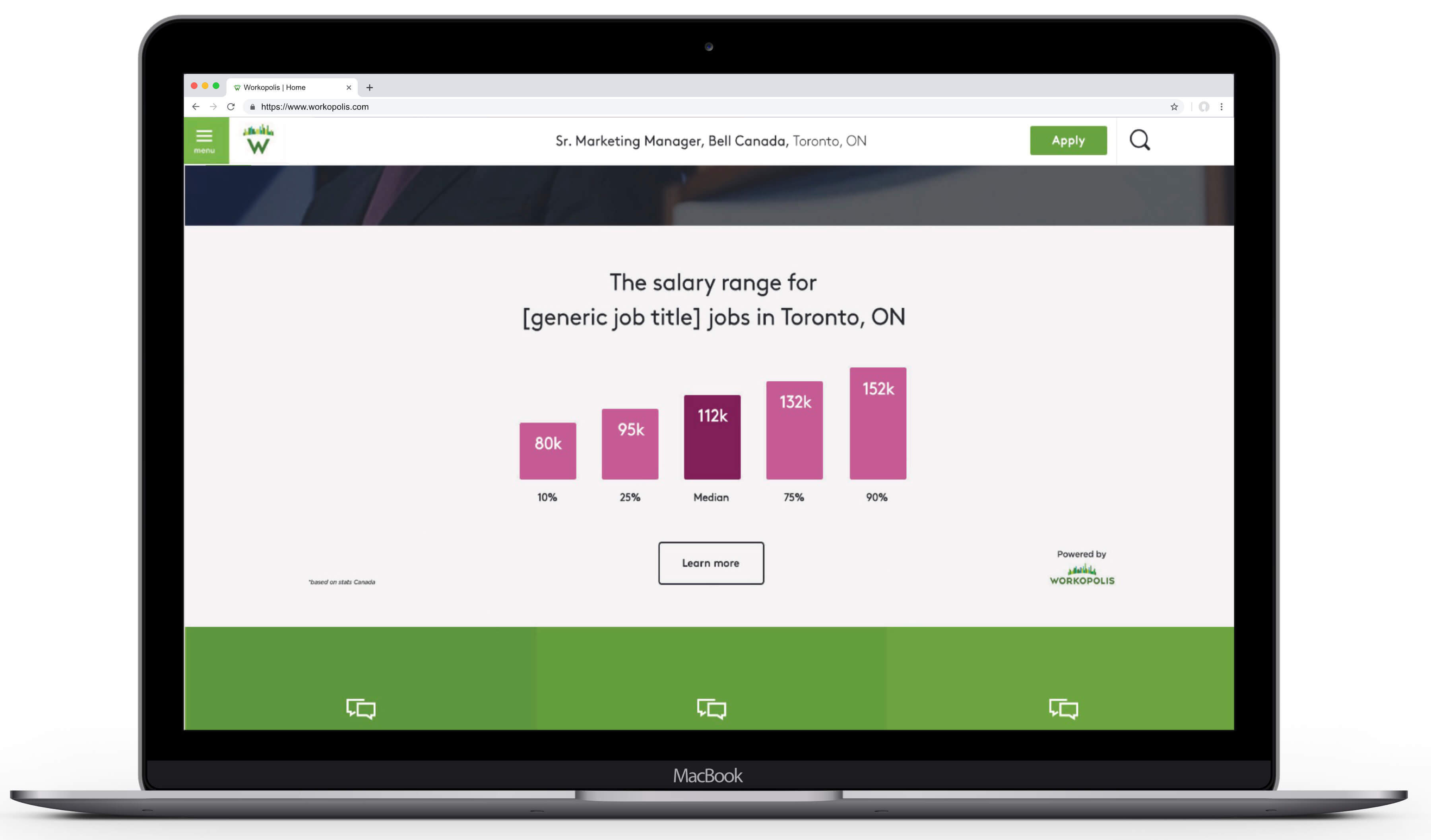
- Fully updated design language with guidelines for consistent use of stock photography, video, infographics
More Work
Advantage All
Branded Content, Film, Social

Projection of Greatness
Branded Content, Film
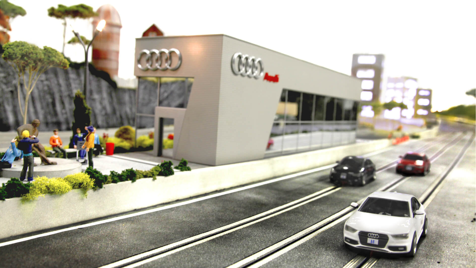
Quattro Experience
Branded Content, Experiential, Gaming

Bell Canada
Film, Digital, Social

Breaking Sound Barriers
Film, Digital, Social
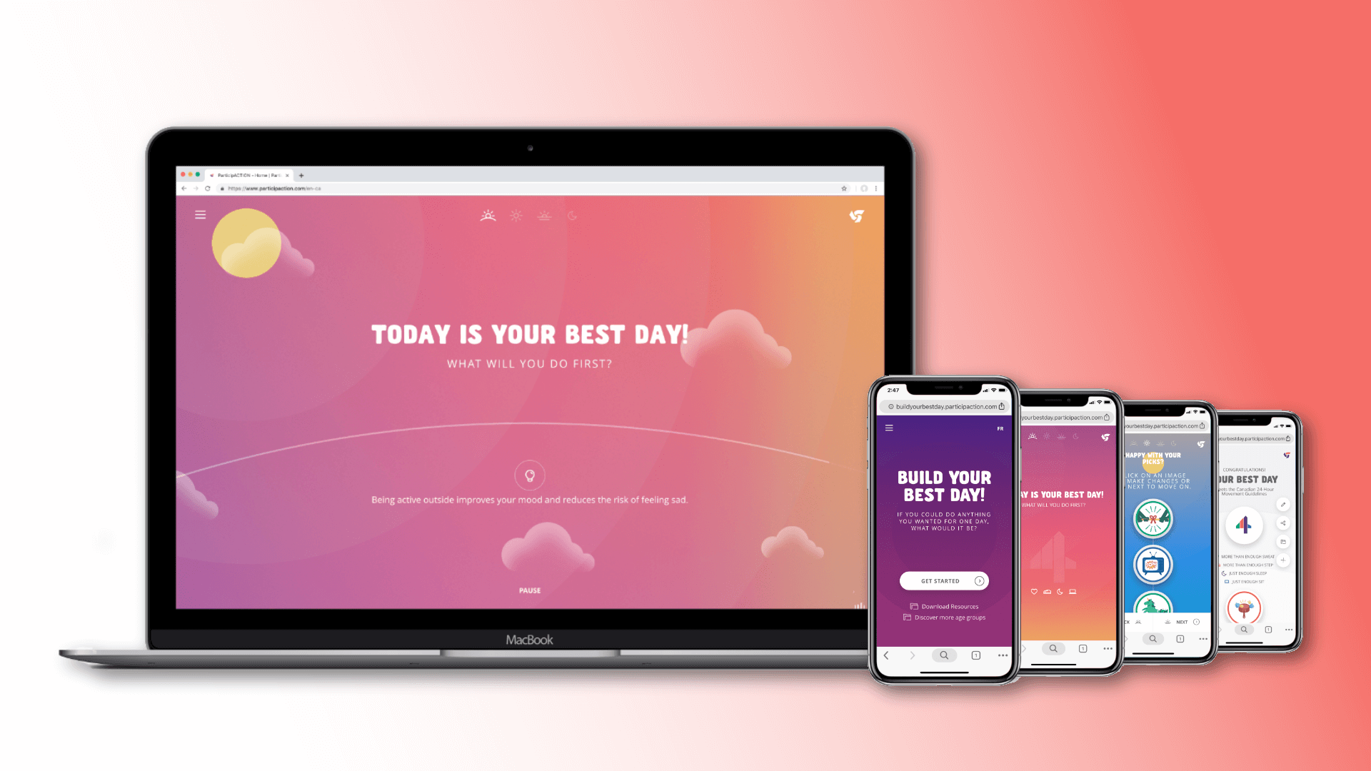
Build Your Best Day
Branded Content, Gaming, Web Design

CAMH.ca
UX & Content Strategy, Web Design
Canaccord Genuity
Brand Refresh

Corona Sun Beam
Branded Content, Experiential
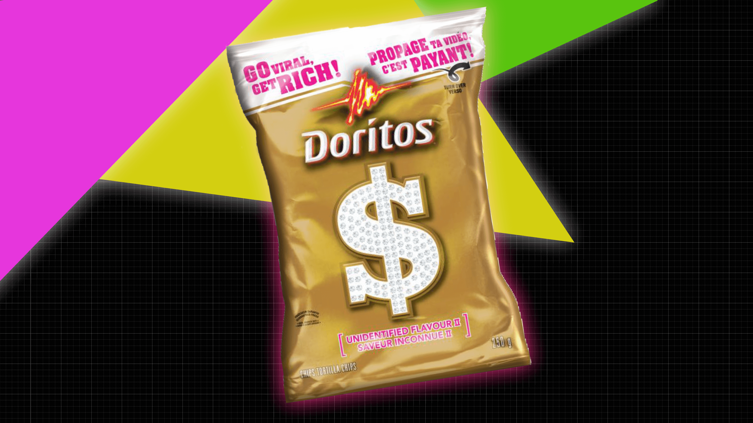
Doritos Viralocity
Integrated, Promotion, Social, Web Design
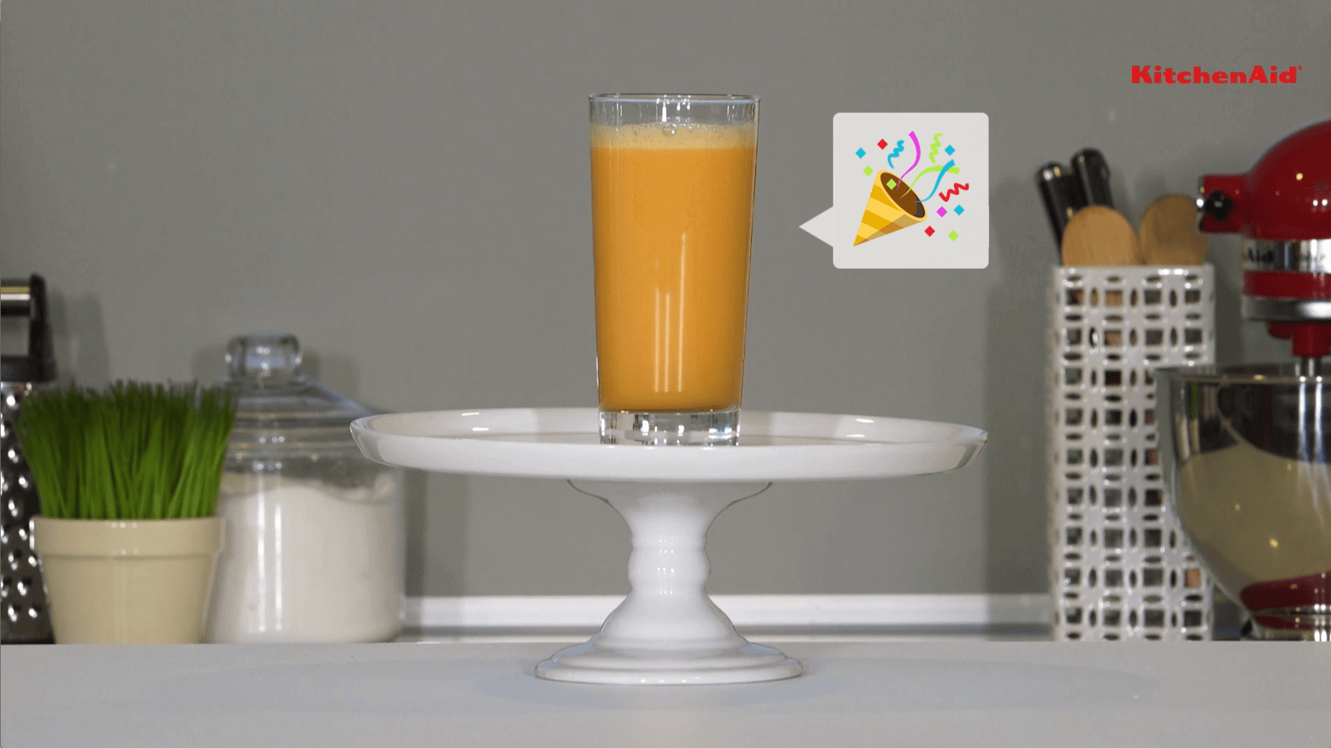
Emoji Smoothie Challenge
Branded Content, Promotion, Social

Everything Gets Better
UX & Content Strategy, Web Design

Fidelity Investments
Film, Virtual Events
Inspiration is Printastic
Branded Content, Social
M&Ms Join The Hunt
Branded Content, Gaming, Promotion, Web Design
Make Cash & Cheques History
Branded Content, Digital, Web Design

Remembrance Island
Branded Content, Gaming, Social

This Is Fine
Film
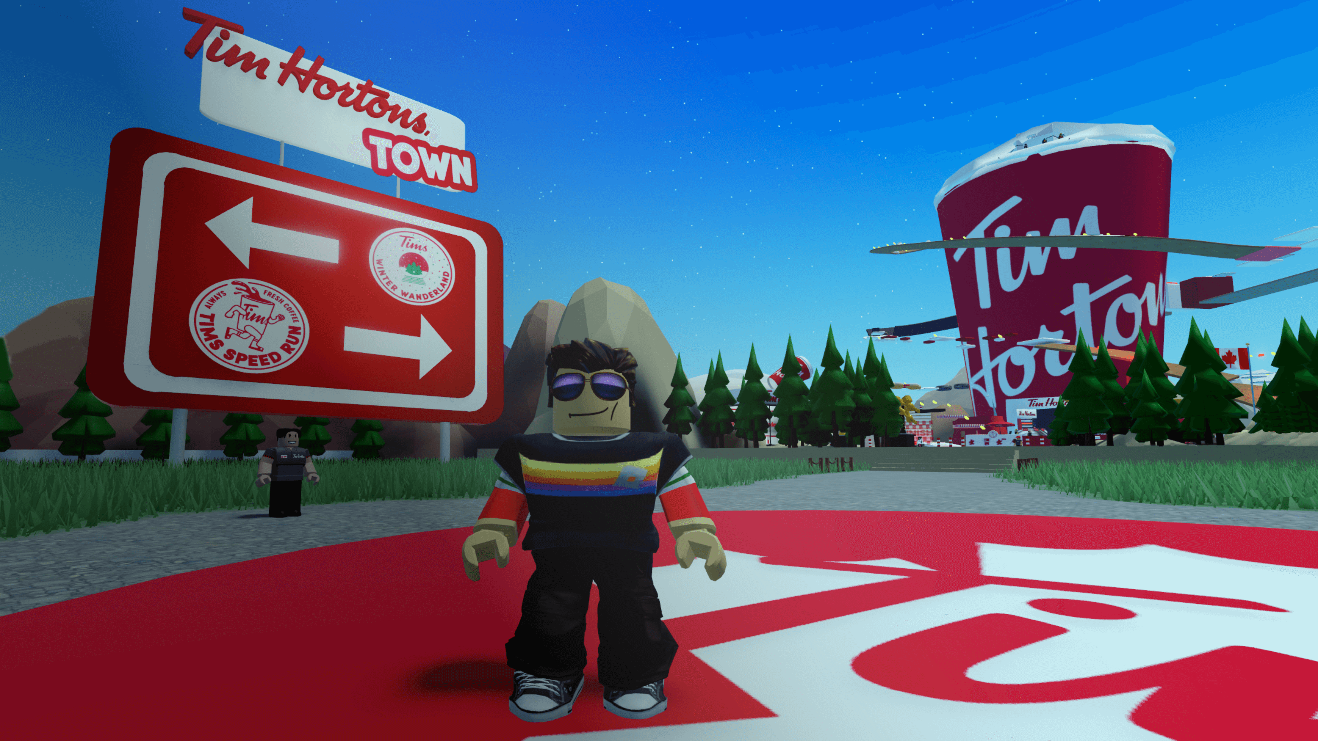
Tim Hortons Town
Branded Content, Gaming

Workopolis Holidays
Branded Content, Film, Self-Promo
Workopolis.com Redesign
UX & Content Strategy, Web Design
Zuligans for Either/Or 2016
Branded Content, Film, Self-Promo
© Copyright 2023, Jonathan Webber. All rights reserved.